While Tik Tok might be (maybe, hmmm, who knows) heading in the direction of Vine, Reels are here to take Instagram into the dizzying heights of quick but entertaining videos.
With this new and exciting addition to Instagram, we have a new set of posting ratios to deal with – as well as thumbnails, content ideas and a whole new way of connecting with our fans.
For those peeps that are rigid on how their feed looks and feels and just cannot deal with anything looking too weird aesthetically, Reels might just send you into a tailspin.
What are the Instagram Reels ratio?
Let’s get the base ratio into play. Reels are meant to be viewed as 9:16 (1080 X 1920) or vertically full screen, which is the exact same format as Instagram Stories that you already know and love.
This is super perfect to show off your dance battle skills. But and we mean but, when you opt to have your Reels displayed on the newsfeed, they will display in post format (that’s a 4:5 ratio for those that need to know). For those in the back, yep that’s portrait 1080 x 1350.
And for your page feed that also means they’ll be cropped to the standard square format (ratio of 1:1) or as we know it, 1080 x 1080.
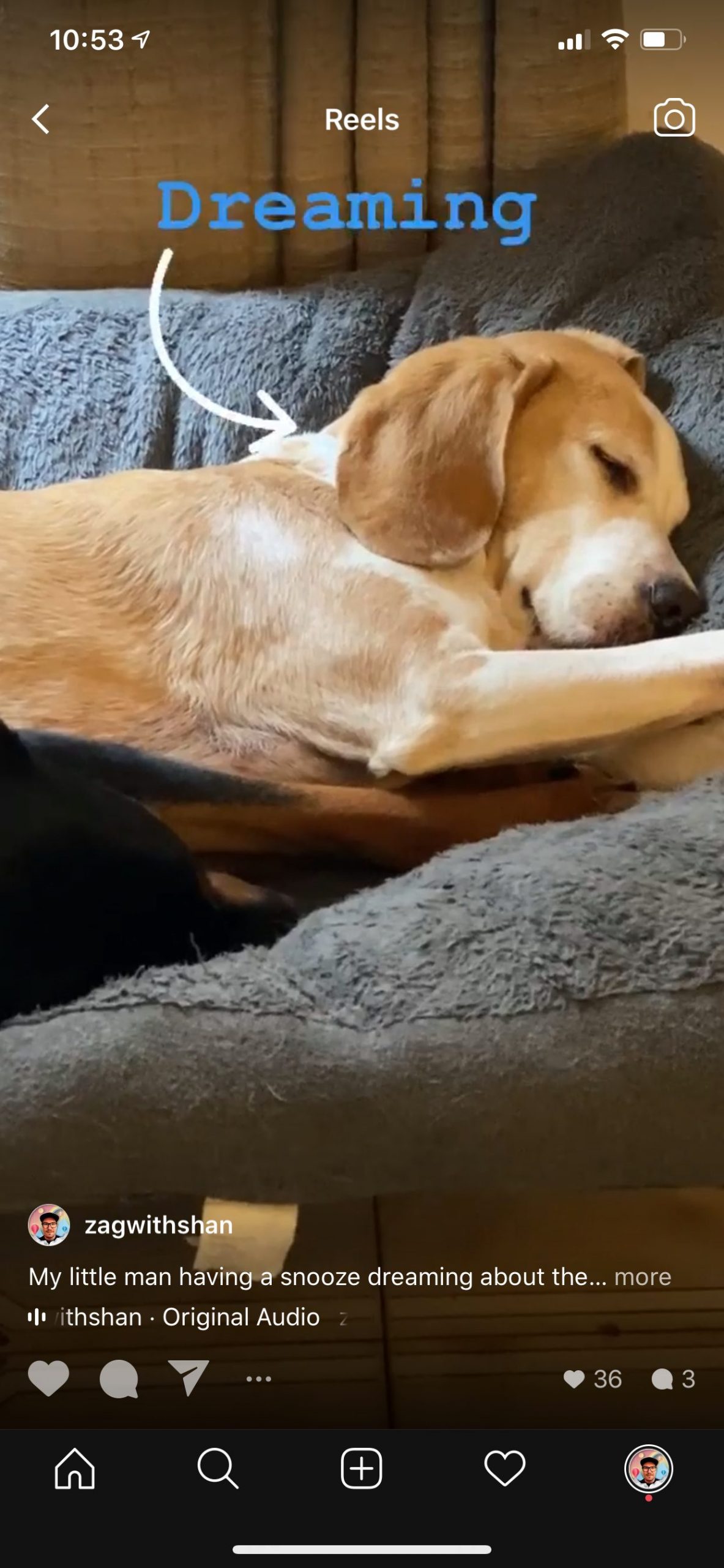
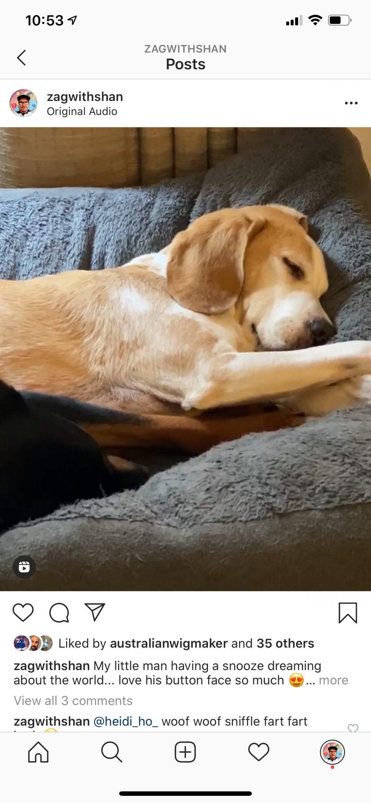
Above you can see how I cut off the text in the Reel for both newsfeed and my feed.
How do you work with that?
So here’s the skinny, you’ll want to make sure the main visual of your content is lined up within the 4:5 ratio area, which means all the good stuff needs to happen in the middle of the 9:16 screen.
This means when your incredibly entertaining video appears in the Reels News Feed, it’s totally clickable and looks like you’re the Reels master. No wired cropped heads, stickers, and text where they should be. Of course, when your reel plays then you can put things wherever you want because it’s all about getting that first click.
What about Reel thumbnails?
A handy feature of Reels is that you can select your own thumbnails – either from the Reel itself or you can add a cover image to it. Depending on your approach to Reels there are pros and cons for either.
If you take the option to use a thumbnail from your video, you can share an interesting point midway or towards the end of your Reel. Taking your fans on a little journey (totes perfect for makeup tuts, before and after etc.). The negative side is you’re really gonna have to get your framing right which might mean a few takes.
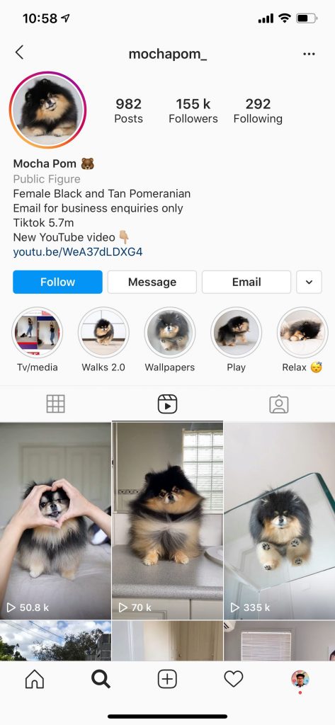
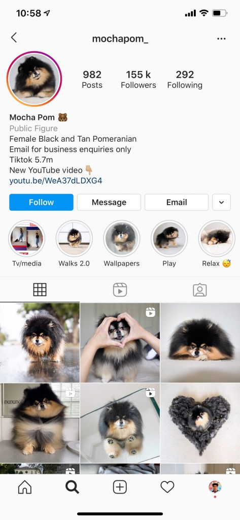
@mochapom_ has pulled their cover image direct from their Reel (and like OMG – cute dog overload).
If you go the curated cover approach, this means total control over how the Reel will appear in all the places on Instagram. The negative side is less off the cuff approach and a fair amount of planning needed before each Reel you create.
Ultimately this is going to be driven by your Reels approach and your overall Instagram strategy – and should always be driven by what your fans wants from you.
What else do I need to know about thumbnails?
The 1:1 ratio Instagram is using is coming from the direct centre of your thumbnail. So any text at all will have to be in this zone or it will be cropped out.
No in-between. No wiggle room. Dead centre.
Who is doing it well?
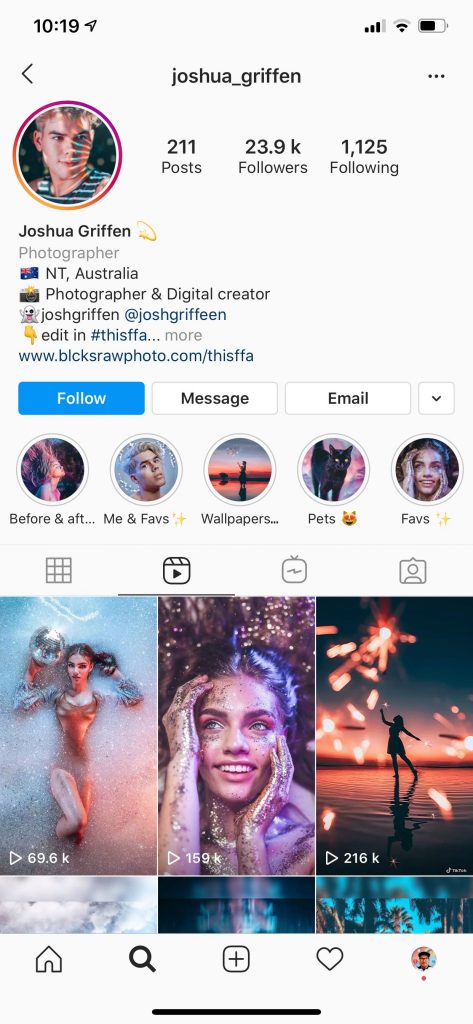
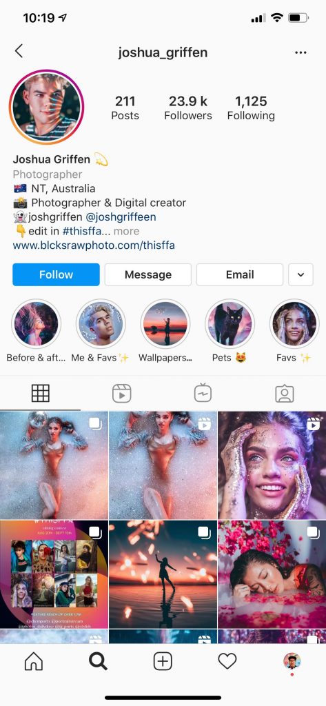
Go and check out @joshua_griffen and what he is doing with his Reels and feed. A photographer from Australia (so derr, of course, he has a GREAT feed).
He has made sure his photos look beautiful from each view as well as creating some incredible visuals.
How do I get the ratios right?
If you want to get those perfect dimensions on your phone while you’re main those incredible Reels I’m gonna make it simple.
- Download this template
- Add it to the photos on your phone
- Head over to Instagram and create a new story and add the image you just saved to your phone.
- You can measure the distance from the top of your phone and bottom of your phone to find the right zone, add little stickers to your phone so you got it right or just make a mental note.
This is a little guide on how you can incorporate your aesthetic into your Reels approach. If you don’t care that much that’s totally cool – go and have fun creating Reels and connecting to your people.



Hi, Shannon.
Thanks for these insights on sizes/relations, kinda nightmare if your agenda has no gaps.
Self described as a “quite technical guy” after 18 years in web design, SEO and even large corp IT ops manager, I find it hard to keep up with the numbers behind Social Media publishing 🙂
Your recap is useful and easy to digest, got my answer after a failed Reel -out of bounds text and cropped logo, yeah man 😉
Best from Barcelona!